
CommBank ID Check
Identity verification for new customers
Team: 1 UX designer (me), 1 UI designer, Scrum team
CommBank has 9 million customers, with 1 million customers creating new transaction accounts every year. All new customers must complete an identification check.
The project
This project was a redesign of Commonwealth Bank of Australia’s (CommBank) online ID check. The flow launched in mid 2020, supporting new customers to create new accounts and verify their identity without needing to go to branch.
CommBank has 1 million customers creating new transaction accounts every year, and every ‘new-to-bank’ customer needs to complete an ID check. With increasing numbers of people opening accounts online, the account application and ID check journey are the front door to the bank.
New customers can use four different documents to verify their identity, and these are checked for validity against government databases and other authorities.

Australian Driver Licence

Medicare Card

Passport

Australian Birth Certificate
The challenge
Increase successful completion of ID Check, and therefore creation of new accounts
Reduce drop outs (before and during flow)
Reduce errors (data entry, ID information)
The journey

ID check is one piece of a broader new-to-bank journey, following on from account application. However, almost 1 in 5 customers were dropping out before even attempting the ID check.
The legacy ID check screens were designed with desktop in mind, and later retrofitted to mobile. Because of this, the screens were far from optimised for the mobile experience, with mobile is increasingly the device of choice for new transaction account applications.
I worked with the analytics and optimisation teams to identity and address the existing issues in the legacy state.
Pre ID check (legacy)
19% of new customers were dropping out on this page, with their accounts not yet active. Was it that they didn’t have time, didn’t have their IDs to hand, or did they think they had already finished?
The header “Thanks <name>, an email is on its way”, colour banded layout, and emphasis on client number gave the impression customers had already completed the process.
Furthermore, in mobile the primary call to action was below the fold, causing users to drop off due to no perceived onward path.

Legacy Pre ID check screen
HYPOTHESIS
We believe that customers find the total application journey lengthy and time consuming
So if we provide context of where they are in the journey
We will see customers continue and complete the process through to activation
Addressing the drop out
The project presented an opportunity to better piece together the multiple steps in the account creation process.
This included keeping customers informed where they’re up to in the application journey, setting expectations of what’s required, and encouraging them through to the process using a progress indicator.
Making it easier and more seamless for new customers to create and access new accounts, reduces frustration, boosts customers’ first impression of the bank, and in turn helps to uplift acquisition and retention.

New pre ID check screen, with progress indicator
Data driven decisions
Analysing the current state data made it easy to focus on easy wins first. Working with the product owner and optimisation team, I focused on most common errors, and specific errors per ID type. The more errors a customer gets, the more likely that they’ll fail or drop out. Each customer only gets a limited number of attempts before they’ll need to visit a branch.
Surprisingly, we found that name was the most common error across all IDs, and accounted for 75% of Medicare card errors. This was three times the error rate compared to driver licence or Australian passport. Once I looked into it, I discovered that most Medicare cards use an initial for middle names, but not always. And, if customers didn’t enter their information exactly as their ID card, they would fail that attempt.

Medicare is a government issued health care card
75% of errors for Medicare were due to the name being incorrect.
How can we ensure customers enter details exactly as per their IDs?
Similarly, international passports had an error rate of 51% on name, compared to just 38% errors for Australian passport names. While different cultures have different naming conventions, the many passports of the world also have varied name formats - further complicating the capture of customers’ names:
Potential name variations across passports
Last name, given name(s)
Given name(s), last name
Last name, first name, middle name(s)
Full name in one string

10% of all digital ID checks use a non Australian passport.
51% of these fail due to an incorrect name.
How might we be universal in our guidance?
Testing and learning
Knowing that 52% of users of the current ID check are on mobile devices, and this number is growing, I took a mobile first approach to the design.
I conducted six rounds of usability testing across mobile and desktop to stress test and iterate the design across multiple scenarios, including non-Australian IDs, multi-part names, parent child applications, and anticipated edge cases.
Early concepts looked at displaying the data they were entering back at the customer on a digital representation of their ID. This was to ensure the correct data was getting captured, and encourage the customer to cross check against their own ID. While this concept was successful in usability testing, it ran into obstacles when we considered all use cases and users.
Dynamic text on the ID image created more problems than it solved:
Long or multi part names would cause the the displayed name to run off the ID image or truncate
Shrinking the font size was not an option due to legibility
Any customers using large font sizes in browser or at the system level would have a sub-optimal experience
Displaying new information above the field in focus would disadvantage screen reader users who wouldn’t receive audible playback automatically
Initial ID guidance concepts

Text dynamically appears on an ID as the user enters their information

Many people have long and multi-part names

Some users set an extra large font size at a browser or system level
HYPOTHESIS
We believe that customers are not entering information exactly as per their IDs
So if we provide specific guidance on where to find each piece of data
We will see more accurate data and an increase in successful completion of ID check
Getting the right data
Due to the risks and constraints outlined above, I pivoted towards a more minimal and robust design. By stripping back the detail, we could focus on highlighting the location of each data point, while also future proofing the design if there were minor updates to ID documents.
One example is a state specific driver licence. In New South Wales, licences have both licence number and card number in separate locations on the ID, and these are easily confused.
The guidance image indicates exactly where to find the correct information, when the associated text field is in focus. State specific help text reinforces the message, and in-line validation catches any errors before submission.
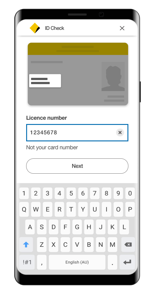
Driver Licence entry - highlighting which information is required
Designing for everyone
Over 4.4 million people in Australia have some form of disability. That's 1 in 5 people. CommBank is on track to be Australia’s most accessible bank. As such, accessibility is baked into all releases as part of the definition of ‘Done’.
The new ID check flow is fully navigable by screen reader or keyboard only users. All text and visuals meet the minimum contrast ratios as defined by WCAG 2.1 - Web Content Accessibility Guidelines.
The use of typeform (asking one or few questions at a time) corresponds to how we would naturally ask for information over the phone or in branch. Chunking information logically in this way and the placement of help text outside of fields reduces the cognitive load for all users, including those with conditions such as memory issues, brain injury, autism, dyslexia or ADHD.

Medicare details entry - Desktop
HYPOTHESIS
We believe that customers are not entering details exactly as per their IDs
So if we provide a summary of the information they’ve entered before submission
We will see more accurate data and an increase in ID check completions
Error prevention
Anyone can make a typo, and still pass the field validation, e.g. minimum number of characters. By designing inclusively, we can support all users to prevent errors and frustration at having to try again.
The ID summary screen aligns with WCAG 2.1 AAA compliance for error prevention, by presenting back user entered information before it’s submitted. This is especially important when a form submission relates to a financial product or legal declaration.
Purposefully adding friction encourages users to stop and check what they’ve entered, supporting users who may have visual or motor impairments.
The edit links provide users a quick way to correct any errors, and the use of horizontal dividers between rows ensures zoom users can easily locate them.

ID Summary screen - adding friction to encourage error prevention
The result
Through data I was able to understand the issues in the current flow, and set up for success through an evidence based redesign.
The dynamic guidance ID image puts the focus on getting the right data. State specific help text, in-line validation, and ID summary screens support customers to catch errors before they happen, to ensure we also get the data right.

Licence details flow - mobile
Commonwealth Bank of Australia has 9 million customers, and has maintained the top spot as Bank of the Year – Online Banking for ten consecutive years, while also taking out Bank of the Year – Mobile Banking Award for four years in a row.
Feedback
“As soon as Mathilda came on board, she immediately immersed herself in the challenging world of online identity verification. And, I was impressed how quickly she was able to get the first draft of the customer experience ready for the Inception phase of the project. This certainly helped both the stakeholders and the team to visualise what the end product might look like.
Mathilda has also been working very closely with Customer Experience Researchers. Thus, she has refined and fine tuned the prototype several times, in a pursuit to validate as many functions as time permits before passing them over to the Scrum team.
Also, Mathilda’s collected and poised demeanour brings a sense of calmness and tranquility to the team. Yet, her passion for her craft - creating the optimal customer experience, undoubtedly shines through when she presents outcomes of research to the stakeholders.“
- Olga, Product Owner on the project